
Why Clinic Websites Should Swap Long Quizzes for Heuristic Modules
Clinic websites should replace long quizzes with heuristic modules to reduce user friction and build trust by routing visitors to relevant content using only a few essential rules of thumb. These lighter interactions improve conversion rates because they prioritize immediate value and mobile usability over the exhaustive data collection that often causes potential patients to abandon a site.
A first-time visitor lands on your fertility site from a paid ad, usually on a phone, still anxious, and immediately meets a 12-question quiz. No doctor yet. No price range. No reason to trust you. Most people close the tab.
Many clinics overuse long quizzes when they really need lighter heuristic modules that cut clinic website UX friction and still improve relevance and routing. That is the case this article makes for clinic owners, product-minded marketers, and patient acquisition teams. You will get a plain-English definition of a heuristic module, a clear read on when a quiz still earns its place, and a design checklist you can apply to fertility and specialty sites this week.
Key Insights
- Long quizzes add friction before trust exists - Cold visitors meet intake-style forms before they have any reason to answer, so they stall or bounce.
- A heuristic module is a short guided block - It uses a few rules of thumb to route a visitor to the right page, not to score or profile them.
- Lighter interactions win on three fronts - Trust, routing, and completion all improve when every question has an obvious payoff and a phone-friendly path.
- Quizzes still fit narrow cases - Eligibility gates, named tools, and post-consult education justify a structured check; cold homepage traffic does not.
- Every question should change what happens next - If an answer does not change routing and no one acts on it, cut it.
Why Long Quizzes Often Underperform On Clinic Websites
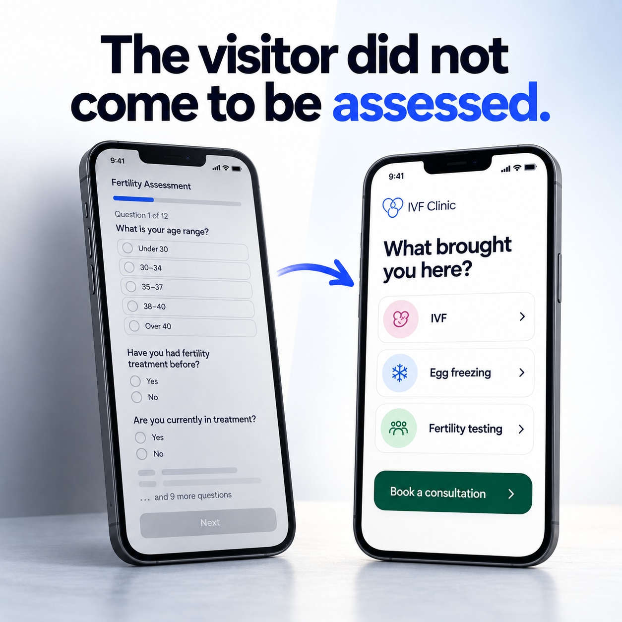
Clinics tend to borrow the direct-to-consumer health quiz and the student-career quiz, drop them onto a medical site, then treat the homepage like an EMR intake screen. The visitor did not come to be assessed. They came to decide whether you are the right clinic.
The common failure modes stack up fast:
- Too many required fields before any value is returned
- Mobile fatigue from a progress bar that never seems to end
- Anxiety about sharing reproductive or medical detail before trust exists
- Questions that never change what the site shows next
- A results screen that reads like a diagnosis from a stranger
Privacy compounds all of it. Collecting extra health detail on a first visit can feel extractive even when your form is fully compliant, so people stall rather than finish. The spirit of the HHS minimum necessary standard - collect only what a task genuinely requires - is a useful UX instinct, not only a compliance one.
Form length itself is the quiet killer. Baymard Institute's checkout research found that the number of form fields a user must handle affects overall usability far more than the number of steps, and that many sites carry far more fields than they need. The lesson transfers directly: asking about cycle history before location or treatment intent, with no skip path for someone who only wanted to book a consult, is exactly the friction that drives drop-off. Clinics that read why lead volume hides downstream leakage already know incomplete forms rarely become booked consults.
What Heuristic Modules Are
A heuristic module is a small, guided block on your site that uses a few rules of thumb - age range, trying to conceive versus already in treatment, location, main concern - to choose the next most useful screen. It is the practical healthcare website quiz alternative because it does less on purpose.
A long quiz tries to score or profile the person. A module tries to route them with good-enough information and then gets out of the way. That difference changes everything about how it feels to a tired visitor.
Fertility website modules can be genuinely small:
- A two-step prompt that sends egg-freezing researchers to a timeline page and IVF-curious visitors to a consult path
- A location chooser that routes to the nearest clinic and its team
- A "what brought you here" card that swaps the proof points shown below it
This is healthcare website personalization tied to the visitor's inferred job-to-be-done, problems, and objections, which is how Irresist serves focused journeys on the fly without rebuilding the whole site. IVF website interactive content can stay light too: cost-range choosers, doctor-match filters, and "am I in the right place" checks rather than scored personality tests.
How Lighter Guided Interactions Improve Trust, Routing, And Completion
Short guided modules improve trust when every question has an obvious payoff, improve routing when answers change the next page, and improve completion when the path is short enough to finish on a phone.
Trust grows when the module shows you are listening, explains why a question is asked, and avoids medical conclusions the visitor never requested. Routing sends people to the right treatment, location, language, or consult type, so your coordinators receive warmer, better-matched inquiries. Completion improves through fewer steps, optional fields, and a visible exit to call or book, which keeps conversion-friendly healthcare UX intact for high-intent visitors who will never touch a quiz.
Measure it in plain terms: track starts versus finishes, calls, and form submits, and watch whether routed pages produce more consults. Irresist-style teams validate uplift with controlled measurement and a weekly optimization loop when that already matches how the clinic works.
When A Quiz Is Still Useful
Use a quiz when the visitor already expects a structured check and the answers change a real gate: an insurance or self-pay path, clinical trial or donor eligibility criteria, medication protocol education after a consult, or a tool they searched for by name. It stays useful only if every question maps to a branch, results remain educational rather than diagnostic, and a human follow-up is offered at the end.
When A Quiz Is The Wrong Tool
Skip the long quiz on cold homepage traffic, first-time fertility researchers, people comparing clinics, and anyone who arrived to book or call. Skip it when marketing wants data more than the patient needs a result, when the questions duplicate what a coordinator will ask anyway, or when your team cannot act on the answers inside the CRM.
Design Checklist For Better Guided Modules
Use this as a scannable how-to when you build or trim a module. It reflects the same rules-of-thumb thinking behind Nielsen Norman Group's usability heuristics and the trust patterns in respectful fertility trust signals.
- Start from the job-to-be-done, not from a data wishlist.
- Cap visible questions to the few that actually change routing.
- Make every question skippable or give it a "not sure" path.
- Show why you are asking, in one short line.
- Never output a diagnosis.
- Keep the module on-brand and mobile-first.
- Let people book or call without finishing.
- Pass answers into the next page so no one is asked twice.
- Capture partial progress only if your privacy policy and clinic ops support it.
- Test copy against anxious, tired, and partner-on-the-phone scenarios.
Irresist builds these as lighter conversion modules that guide visitors without exhausting them, then serve the most relevant journey to each person.
What To Do Next
Audit your current quiz against one test: does every question change what the visitor sees or does next? If it does not, that question is friction, and the quiz is probably the wrong tool for your cold and paid traffic. Pull the questions that never branch, keep a one-to-three-step module that routes to the right page, and leave a book-or-call exit visible the whole time. If you want that built and measured against your real consult numbers rather than guessed at, see how Irresist deploys focused patient journeys on your existing site.
FAQ
What is a healthcare website quiz alternative?
A healthcare website quiz alternative is a short heuristic module: a small guided block that uses one to three questions to route a visitor to the most relevant page. It replaces a long scored quiz with just enough input to help, without the intake-form friction.
What is a heuristic module on a clinic website?
A heuristic module is a lightweight interaction that applies simple rules of thumb - like location or trying to conceive versus already in treatment - to send a visitor somewhere useful. For example, a two-step prompt might route egg-freezing researchers to a timeline page and IVF-curious visitors to a consult path.
Why do long quizzes fail on medical websites?
They ask for too much before trust exists, they tire mobile visitors, and they raise privacy anxiety around reproductive detail. Worse, many questions never change what the site shows next, so visitors stall on data collection that no one ends up using.
When should a fertility clinic keep a quiz?
Keep a quiz for eligibility gates, tools a visitor searched for by name, and medication or protocol education after a consult. In those cases, a structured check is expected, and it works only if every question branches, results stay educational, and a human follow-up is offered.
How many questions should a clinic website ask before a consult CTA?
Ask only the questions that change routing, usually 1 to 3. Offer a way to book or call immediately, so high-intent visitors never have to finish anything to reach you.
Can you personalize a clinic site without a long quiz?
Yes. Use inferred intent and a few signals to swap proof points and next steps through fertility website modules, rather than scoring the visitor. This keeps personalization respectful and phone-friendly while still matching each person to the right treatment, location, or consult path.